Welcoming Everyone: Accessible Web Design Trends
I was taking a morning walk down South Lake Avenue the other day, grabbing my favorite coffee near Playhouse Village, when I noticed a family of tourists trying to plan their afternoon. They were huddled around a smartphone, squinting at a local hotel website that simply would not load properly for the father, who was using a screen reader to find the booking page. It made me realize that our famous Southern California hospitality needs to extend far beyond our physical front doors. That is why I want to talk about some of the most important accessible web design trends for California tourism businesses today. If we want visitors to love our state, we have to make sure they can actually get through our digital doors first.
Think about the last time you visited the Makers Hive Market at Pasadena Commons. You probably appreciated the wide aisles, the clear signs, and the friendly vendors who were ready to answer any questions you had. Our digital spaces need to offer that exact same level of care and consideration for every single person who stops by to browse. When we ignore digital barriers, it is exactly like leaving a massive pothole right in front of your shop during normal business hours.
We are going to explore how local hotels, tour guides, and attractions can make their websites just as inviting as a sunny afternoon in Old Pasadena. You do not need to understand complex code or technical jargon to grasp these concepts. You just need a desire to treat your website visitors like neighbors dropping in for a cup of tea. If you are ready to see how your site measures up, you can always Get my free website audit to start your journey.
Embracing Accessible Web Design Trends Locally
When we talk about accessible web design trends, we are really just talking about modern ways to show common courtesy online. Over the past few years, California tourism businesses have started to realize that a beautiful website is absolutely useless if half of their potential guests cannot navigate it. It is similar to building a gorgeous new restaurant but completely forgetting to install a ramp at the entrance. The tourism industry thrives on making people feel comfortable and cared for from the very first interaction.
For a neighbor using a screen reader, your website is essentially translated into spoken audio. If your website is built with messy code, that audio translation becomes a confusing jumble of random words and broken links. Local businesses are now prioritizing clean, organized digital structures to ensure these audio translations make perfect sense. It is the digital equivalent of having a helpful concierge greet guests the moment they walk into your lobby.
This shift toward better digital hospitality is not just about avoiding complaints or keeping up with legal requirements. It is about fundamentally expanding who gets to experience the beauty of our local neighborhoods. When a family is planning a trip to see the roses bloom or to catch a game at the local stadium, their excitement should not be ruined by a frustrating booking process.
The Digital Front Door of Your Hotel
Your homepage is the digital front door to your business, and it needs to swing wide open for absolutely everyone. Many old websites rely on flashy animations and complex layouts that act like heavy, stubborn doors that are difficult to push open. One of the best trends right now involves simplifying these homepages so that the most important information is incredibly easy to find. Visitors want to know your location, your hours, and how to book a room without having to dig through confusing menus.
Imagine trying to read a neighborhood map where all the street names are written in tiny, faded letters. That is how a lot of older websites feel to folks with visual impairments. Today, thoughtful designers are using large, bold text that stands out clearly against the background. This ensures that a grandmother planning a family reunion can read your amenities list without needing to hunt for her reading glasses.
We also have to think about how people actually move around once they step inside your digital lobby. A well-designed website provides clear headings and logical pathways, much like the clearly marked sections of a local department store on South Lake Avenue. If a visitor gets lost on your site, they are likely to just leave and book a room with your competitor down the street.
Clear Pathways and Keyboard Navigation
Not everyone uses a standard computer mouse or a touch screen to browse the internet. Many of our neighbors and visitors rely entirely on their keyboards to jump from one link to the next. If your website requires a mouse to open a menu or select a date on a booking calendar, you are actively blocking people from doing business with you. This would be like forcing every customer to climb a steep flight of stairs just to reach your cash register.
The current trend in California web design is to ensure that every single button and link can be reached simply by pressing the Tab key. As the user tabs through the page, a visible outline should highlight exactly where they are, so they never lose their place. It is a simple courtesy that acts like a brightly lit pathway guiding a guest to their exact destination.
I always encourage local business owners to try navigating their own websites using only their keyboard for a few minutes. You might be surprised to find that you cannot easily close a pop-up window or select a specific tour package. If you discover these hidden barriers, do not panic, because you can easily Test my website with professional help to map out a clear plan for fixing them.
Bright Signs and Readable Colors
Color choices play a massive role in how welcoming your website feels to the public. For a long time, it was trendy to use light gray text on a white background because it looked sleek and modern. However, that lack of contrast makes the text nearly invisible to anyone with less-than-perfect vision or anyone trying to read their phone in the bright California sun. It is exactly like printing a restaurant menu in yellow ink on white paper.
We are now seeing a return to strong, high-contrast color schemes that prioritize readability above all else. This does not mean your website has to look boring or purely black and white. It simply means ensuring there is enough difference between your text color and your background color so that the words practically jump off the screen.
You also have to be careful about using color as the only way to share important information. If a booking form simply turns a text box red when someone makes a mistake, a colorblind visitor might never notice the error. Providing clear, written text explaining the mistake is a much friendlier way to help your guests correct their information and finish their booking.
Painting a Picture with Image Descriptions
California is a state built on stunning visuals, from the beaches of the coast to the historic architecture right here in Pasadena. Tourism websites naturally rely heavily on beautiful photographs to sell these experiences to potential travelers. However, a person using a screen reader cannot see those photographs unless you take the time to describe them behind the scenes. This hidden description is known as alternative text, and it is a crucial part of digital hospitality.
Writing good image descriptions is like sitting next to a friend and telling them about a beautiful sunset over the San Gabriel Mountains. Instead of just labeling a photo as “image123,” you should write a short sentence describing the smiling tour guide standing in front of a historic local monument. This extra step ensures that everyone gets to share in the excitement and anticipation of their upcoming trip.
Many local attractions are updating their entire photo galleries to include these thoughtful, descriptive captions. It takes a little bit of time, but it shows a deep level of respect for your audience. It proves that you want every single visitor to experience the magic of your destination, regardless of how they access your website.
Booking Forms That Act Like Friendly Clerks
The booking form is usually the final step a visitor takes before officially becoming your customer. Unfortunately, poorly designed forms are responsible for countless lost reservations every single year. When a form asks confusing questions, resets without warning, or fails to explain errors clearly, it feels like dealing with an incredibly rude clerk at a physical front desk. Visitors will quickly lose patience and abandon their travel plans entirely.
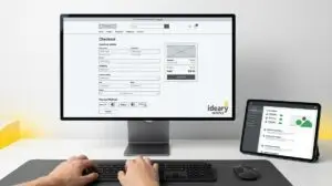
Modern, accessible forms are broken down into small, manageable steps with incredibly clear instructions. Every single text box should have a visible label sitting right next to it, so the user always knows exactly what information is required. If someone types their phone number in the wrong format, the form should politely explain how to fix it instead of just displaying a generic error code.
We need to treat the checkout process like a pleasant conversation with a helpful neighbor. You want to guide the visitor smoothly through the transaction, confirming their details and thanking them for their business. This level of digital care builds immense trust and guarantees that your guests will start their vacation in a fantastic mood.
Financial Help for Neighborly Upgrades
I know that updating an older website can feel like a daunting task for a small tour operator or a boutique hotel owner. It takes time, effort, and financial resources to renovate a digital storefront to meet these modern standards of hospitality. Fortunately, there is a wonderful bit of support available for businesses that want to do the right thing. The government actually offers financial incentives to help offset the costs of making these vital accessibility improvements.
Many folks do not realize that the IRS Section 44 Disabled Access Credit can be used to help cover the costs of accessible web design. This credit is designed specifically for small businesses to help them remove barriers, both physical and digital, for their customers. It is basically a helping hand from the tax folks to encourage you to make your business more welcoming to the entire community.
Taking advantage of this credit makes upgrading your website a smart financial decision as well as a moral one. You get to improve your digital presence, reach more customers, and potentially lower your tax burden all at the same time. It is a fantastic opportunity to invest in your community while simultaneously strengthening your own business foundation.
Taking the Next Step for Your Visitors
Creating an accessible digital experience is an ongoing journey, much like maintaining a beautiful storefront on a busy neighborhood street. You do not have to fix every single detail overnight, but you do need to start taking steps in the right direction. The most important thing is simply showing your guests that you care about their experience and that you are actively working to welcome them.
Start by looking at your homepage through the eyes of a visitor who might be struggling to navigate it. Small changes, like increasing your text size or adding descriptions to your photos, can make an enormous difference in how people perceive your brand. Every little improvement builds a stronger connection between your business and the travelers who are eager to visit California.
If you are feeling overwhelmed and unsure of where to begin, you do not have to tackle this project alone. There are friendly folks ready to help you figure out exactly what your website needs to shine. You can always Claim my free audit & roadmap to get a clear, jargon-free plan for making your digital front door as welcoming as our beautiful Pasadena neighborhoods.