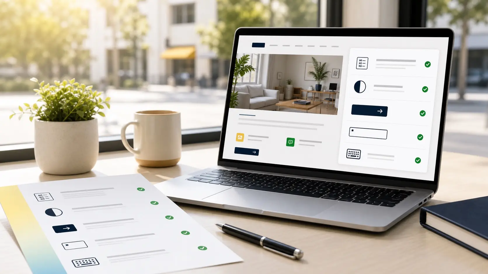
A simple look at the first page most customers see
For many businesses, the homepage is the front door of the website.
It is often the first page a customer sees. It is where people decide whether they understand the business, trust the business, and know what to do next. A homepage does not need to explain everything. But it should make the next step feel clear.
That is why a homepage accessibility review is a practical place to begin.
It is not a full audit of every page. It is not a promise that the entire website is finished. It is a first look at the page that carries the most weight.
“A homepage review is not about finding every possible issue. It is about finding the barriers that can stop people at the front door.”
The first question is simple
Before looking at code, tools, or standards, a homepage review starts with a basic question:
Can people understand this page and use it without unnecessary effort?
That question matters for everyone. It matters for people using screen readers. It matters for people who navigate by keyboard. It matters for older customers, mobile visitors, people with low vision, and anyone trying to find information quickly.
Accessibility often sounds technical because the details can be technical. But the purpose is human. A website should help people read, decide, click, book, call, buy, or ask for help.
If the homepage makes those actions difficult, the business may lose customers without ever knowing why.
Readability comes first
One of the first things to review is whether the page is easy to read.
Small text, pale gray type, busy image backgrounds, and low contrast can all create friction. A homepage can look elegant and still be hard to read, especially on a phone or in bright daylight.
A review looks at the main headline, supporting text, buttons, navigation, footer, and any important details such as hours, services, or contact information.
The goal is not to make every website look the same. The goal is to make sure the design does not hide the message.
“Good design should make the message easier to reach, not harder to find.”
The page structure should make sense
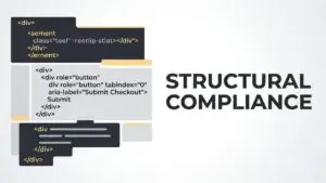
A homepage is more than what people see on the screen. It also has a structure that helps browsers, search engines, screen readers, and assistive technology understand the page.
Headings should follow a clear order. Sections should make sense. Important content should not depend only on visual placement. Buttons and links should be named in a way that explains where they go.
When structure is unclear, some visitors have to work much harder to understand the page. In some cases, they may not be able to use it at all.
A review looks for these structural issues and explains them in plain language.
Navigation should work without a mouse
Many people use a mouse or trackpad. Not everyone does.
Some visitors use a keyboard. Some use switch controls or other assistive technology. Some simply prefer keyboard navigation because it is faster.
A homepage review checks whether someone can move through the page, open the menu, reach important links, and use buttons without relying only on a mouse.
This is especially important for menus, popups, forms, appointment buttons, and contact links. If the keyboard path breaks, the customer journey can break with it.
Buttons need to be clear
Buttons are small, but they carry important business actions.
A homepage may ask someone to book an appointment, request a quote, view a menu, call the office, visit a shop, or start a free review. If the button text is vague, the next step becomes less clear.
A review looks at both the words and the usability of buttons. Are they easy to see? Are they large enough to tap? Do they have enough contrast? Does the text explain what will happen next?
The best buttons do not force people to guess.
Images should not do all the work
Images help a website feel real. They can show a location, product, service, team, or atmosphere.
But images should not be the only place where important information lives. If a sale, menu, event, offer, or announcement appears only inside an image, some visitors may miss it. Search engines may also miss part of the message.
A homepage review checks whether images have useful descriptions where needed and whether important information is also available as real text on the page.
This helps people who cannot see the image. It also helps people on slow connections, small screens, or devices that display content differently.
Forms and contact paths matter
The homepage often points visitors toward a form, phone number, booking link, email address, or contact page.
Those paths need to work clearly.
If a form field has no label, an error message is confusing, or a phone link is hard to find on mobile, a visitor may stop. The issue may seem small from the business side, but from the customer side it can feel like a closed door.
A homepage review looks at these contact paths because they connect accessibility directly to business results.
“When a contact path is hard to use, accessibility becomes a customer service issue.”
Automated scans are only part of the picture
Automated tools can help find certain problems. They may flag missing image descriptions, contrast issues, form problems, or technical errors.
But they cannot fully understand whether the page makes sense to a person.
They cannot always tell whether a button label is helpful, whether a form feels clear, whether the navigation path is confusing, or whether the content supports the customer journey.
That is why a practical review combines tools with human inspection.
A homepage review gives you a starting point
Most businesses do not need to fix everything in one day.
They need to know where to start.
A homepage accessibility review can show the most visible barriers, explain why they matter, and point toward the next practical steps. Sometimes the first improvements are simple. Sometimes the review shows a deeper pattern in the website.
Either way, the value is clarity.
You can see what is working, what is getting in the way, and what should be improved first.
Better access begins with the first page
A homepage should welcome people into the business.
It should be readable, understandable, and usable. It should help visitors move from interest to action. It should not quietly block people because of unclear structure, weak contrast, broken keyboard navigation, or confusing contact paths.
Accessibility begins with paying attention to those moments.
A better homepage does not only help people with disabilities. It helps more customers use the website with confidence.