Why a toolbar is not the same as an accessible website
Accessibility widgets can look like an easy answer.
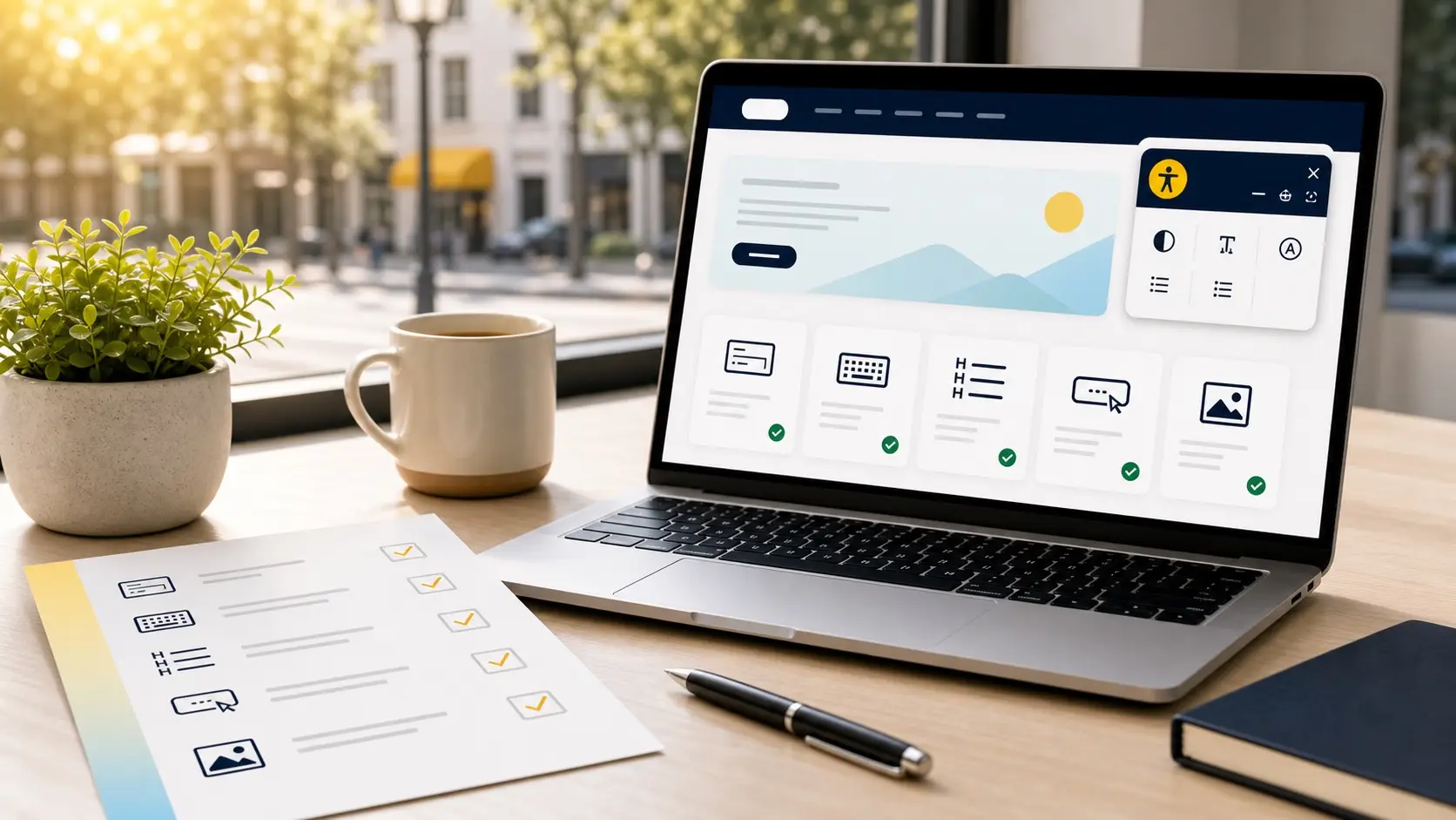
Add a small icon to the corner of the website. Let visitors open a toolbar. Offer options for contrast, text size, spacing, or other display changes. The promise can sound simple: install one tool and make the website accessible.
But websites do not become accessible just because a toolbar appears on the page.
Some widgets may offer useful features for some visitors. The problem begins when a widget is treated as a full fix for deeper website issues.
“Accessibility is not something that sits on top of a website. It has to work inside the website.”
The real barriers are often underneath
Many accessibility barriers are built into the structure of a website.
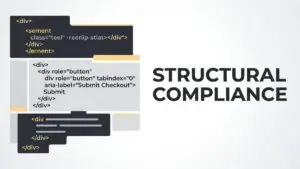
A form field may not have a proper label. A menu may not work with a keyboard. A button may not explain what it does. A heading may be used only because it looks large, not because it gives the page a clear structure.
These problems cannot be fully repaired by changing colors or adding a toolbar.
The same is true for missing image descriptions, confusing error messages, poor focus order, inaccessible popups, and content that is only available inside an image.
A widget may change how something looks. It usually does not rebuild how the website works.
Visitors should not have to fix the page first
One of the quiet problems with accessibility widgets is that they can shift work onto the visitor.
If someone has to open a tool, choose settings, adjust the page, and hope the website becomes easier to use, the experience is already asking extra effort from the person who needed better access in the first place.
Many visitors will not know the widget exists. Some may not trust it. Some assistive technology users may already have their own settings, tools, or browser preferences.
The website itself should be clear and usable before anyone opens an extra panel.
“A customer should not need to repair the experience before they can use it.”
Widgets can create a false sense of safety
For business owners, the biggest risk is often not the widget itself.
It is the false sense of safety that can come with it.
A business may believe the website is now handled. The team may stop looking at forms, buttons, headings, content, mobile layouts, or keyboard access. New pages may be added without review. Old problems may stay hidden.
That can leave real barriers in place.
Accessibility is not a one-time switch. Websites change. Content changes. Plugins change. Forms change. A business needs a practical way to review and improve the parts of the website that people actually use.
Automated tools cannot understand everything
Many widget products rely on automated scanning and automated changes.
Automation can help find some issues. It can be useful as part of a review. But it cannot understand every customer path.
It cannot fully judge whether a button label is meaningful. It cannot always tell whether a form error message is helpful. It cannot understand the business context behind a page. It cannot know whether the navigation feels clear to a person using the site for the first time.
That is why human review matters.
Tools can support accessibility work. They should not replace it.
Accessibility is more than visual adjustment
Some widget features focus on visual changes.
They may adjust colors, text size, spacing, or contrast. These features can help some users in some situations. But accessibility also includes structure, meaning, movement, forms, controls, compatibility, and the way a visitor moves through a task.
A website can offer a contrast toggle and still have a form that a screen reader cannot understand.
A website can offer larger text and still have a menu that does not work by keyboard.
A website can show an accessibility icon and still leave customers stuck at checkout, booking, or contact.
The presence of a widget does not answer the deeper question:
Can people actually use the website?
Good accessibility starts with the page itself
The better approach is to make the website itself more usable.
That means using clear headings, readable text, helpful links, labeled form fields, visible focus states, meaningful buttons, accessible images, and navigation that works without a mouse.
It also means testing important paths. Can someone contact the business? Book an appointment? Request a quote? Read the menu? Donate? Apply? Buy? Find the address?
These are the moments where accessibility becomes business reality.
“The goal is not to add an accessibility symbol. The goal is to remove the barriers behind it.”
When a widget may still have a place
This does not mean every accessibility tool is useless.
Some tools can provide helpful user preferences. Some can support testing. Some can make certain adjustments easier for visitors who want them.
The key is honesty about what the tool can and cannot do.
A widget should not be presented as proof that a website is accessible. It should not be used as a substitute for reviewing the actual website. It should not stop a business from fixing problems in the source code, content, design, and user flows.
If a tool is used, it should support a broader accessibility strategy.
It should not be the strategy.
A better first step
For many businesses, a better first step is a practical review of the pages that matter most.
Start with the homepage. Then look at the contact form, appointment flow, product page, checkout, donation form, or any page where customers take action.
The goal is to find the barriers that affect real visitors.
Once those barriers are visible, the business can decide what to fix first. Some improvements may be simple. Others may require design or development work. But the effort goes into the website itself, where customers actually need it.
That is a stronger foundation than relying on a one-click promise.
Accessibility should feel built in
A website should not ask visitors to work around its problems.
It should be readable, understandable, and usable from the start. It should support people with different devices, different abilities, different settings, and different ways of moving through a page.
A widget may sit on top of the website.
Real accessibility is built into the experience.