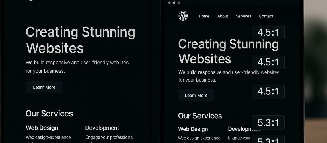
Many designers feel that making a site accessible means sacrificing visual appeal. In reality inclusive WordPress themes can be both beautiful and compliant. By following the WCAG 2.1 Level AA guidelines you can ensure that users with low vision, color blindness, or motor impairments can navigate and interact with your site without losing your brand’s unique style MDN Web Docs. This article explains how to blend aesthetics with accessibility for a US audience, turning compliance into a design advantage.
Ensuring Sufficient Color Contrast
Choosing brand colors is an essential step in theme design, yet many popular palettes fail to meet the minimum contrast requirements. WCAG 2.1 specifies a contrast ratio of at least 4.5 to 1 for normal text and 3 to 1 for large text, meaning every foreground and background combination must be tested for legibility webaim.org. You can use free online tools such as the WebAIM Contrast Checker to verify that your headings, body text, and interactive elements pass these thresholds. By adjusting the lightness of your brand colors, you can preserve your visual identity while ensuring everyone can read your content.
Choosing Accessible Typography
Selecting the right typeface and setting appropriate text properties contribute greatly to inclusivity. Sans-serif fonts like Arial or Poppins render clearly on screens and help users with dyslexia or low vision follow lines of text. Aim for a base font size of at least sixteen pixels, which improves readability on both desktop and mobile devices. Line height should be no less than one point five times the font size so that lines do not crowd together on smaller screens. These settings protect your design’s rhythm while addressing the needs of diverse audiences.
Maintaining Clear Layouts and Spacing
Whitespace and consistent grid layouts guide the eye and reduce cognitive load. When content spans approximately fifty to sixty characters per line, readers can scan without losing their place. WordPress block themes and page builders like Elementor Pro offer responsive grid controls that adapt your layout across devices. By defining clear sections with ample padding around text and media you create breathing room that benefits all users, especially those with attention or processing difficulties.
Crafting Distinct Focus Indicators
Keyboard users rely on visible focus indicators to know which element is active. Without custom styling default browser outlines can be thin and easy to miss. Adding a high-contrast outline around focused links and buttons not only meets WCAG requirements but also reinforces your brand’s accent colors. For example, a two-pixel solid yellow ring around interactive elements signals both functionality and style. Consistent focus indicators empower users who navigate without a mouse and enhance the experience for power users who prefer keyboard shortcuts.
Handling Decorative Versus Informative Media
Not all images convey essential information. When you include decorative graphics such as background patterns or ornamental icons you should mark them as decorative by leaving the alt attribute empty, for example alt=”” webaim.org. Informative images require concise alternative text that communicates their purpose, such as alt=”Wireframe mockup of homepage layout.” For complex visuals like charts or infographics you should provide a text description that explains the data in full sentences. This approach ensures that assistive technologies can present all content meaningfully without altering your design.
Testing and Iteration
Automated tools catch many issues but cannot replace human judgment. After scanning your site with tools such as WAVE or axe, enlist users with disabilities to test your theme on real devices. Observe their interactions and gather feedback on color legibility, font readability, and navigation clarity. Iterating based on real-world insights turns accessibility from a checklist item into a continuous design improvement process.
Conclusión
Accessibility need not constrain creativity. By paying attention to color contrast ratios, choosing screen-friendly typography, organizing clean layouts, styling focus indicators, and providing appropriate media descriptions you craft WordPress themes that look exceptional and work for everyone. Inclusive design not only satisfies US legal expectations under the ADA but also broadens your audience and strengthens brand loyalty.
¿Está preparado para hacer que su sitio web WordPress sea compatible con la ADA?
Tanto si está empezando como si está listo para actuar, le ayudaremos a crear un sitio web accesible, legalmente seguro y fácil de navegar para todos los usuarios.
- Totalmente compatible con ADA y WCAG 2.1
- Implementado por expertos en accesibilidad de WordPress
- Sin conjeturas jurídicas: sólo resultados claros y seguros


